KREAN has carried out the projects and the design management of the interior refurbishment, façade and exterior urbanisation of the Max Center Shopping Centre in Barakaldo, Bizkaia.
The building, which was constructed in 1994, consists of two floors under ground level and two above. The two basements and part of the roof are used for parking and auxiliary services. The ground and the floors above ground level are for shopping use.
With a total investment of 20 million euros, since 2016, KREAN has accompanied IBERIAN ASSETS, the owner of the shopping centre, in this refurbishment process, which culminated at the end of the summer of 2022. The aim of the project has been to modernise and completely renovate the image of the centre, to achieve a more attractive aesthetic, and to reposition the centre as a shopping reference in Bizkaia.
The conceptual design that REIFY developed for the remodelling establishes a new identity for the centre inspired by the natural and urban references of the region, the Urkiola Natural Park and the Bilbao skyline, and implements the most innovative digital trends in the sector in the building. In this way, it establishes three areas in the building, Mountain, City and Digital, identifiable both internally and externally thanks to the differentiating treatment applied to each of them.
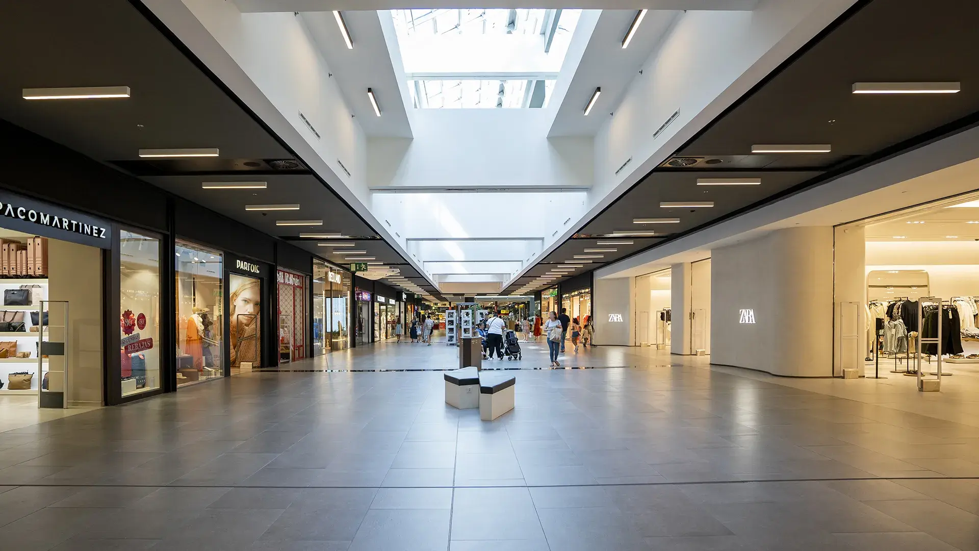
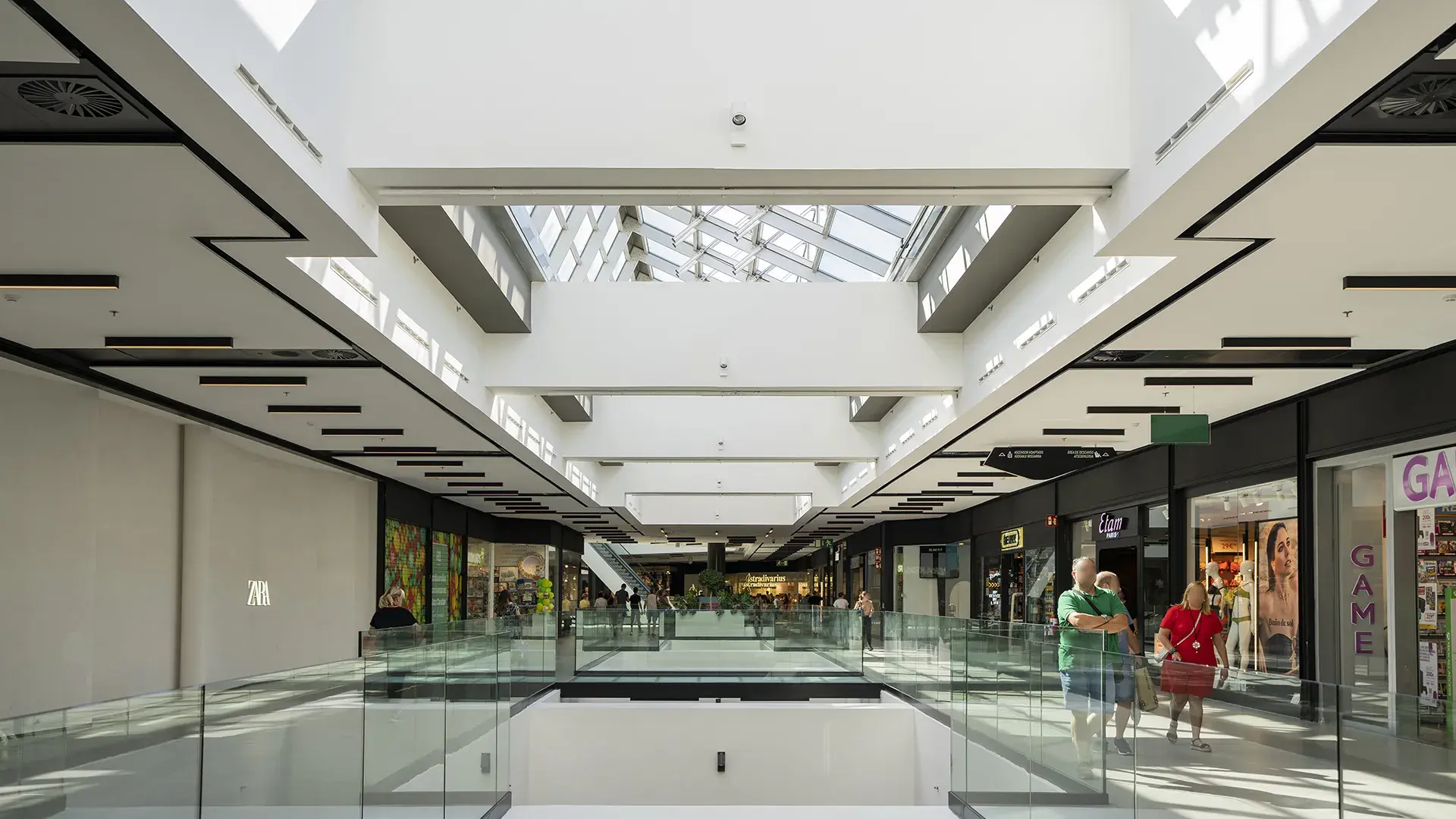
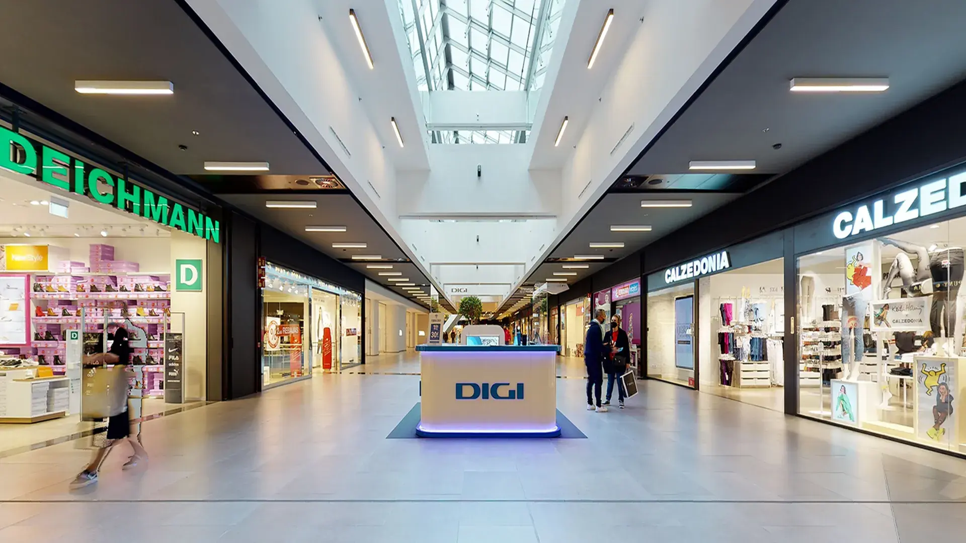
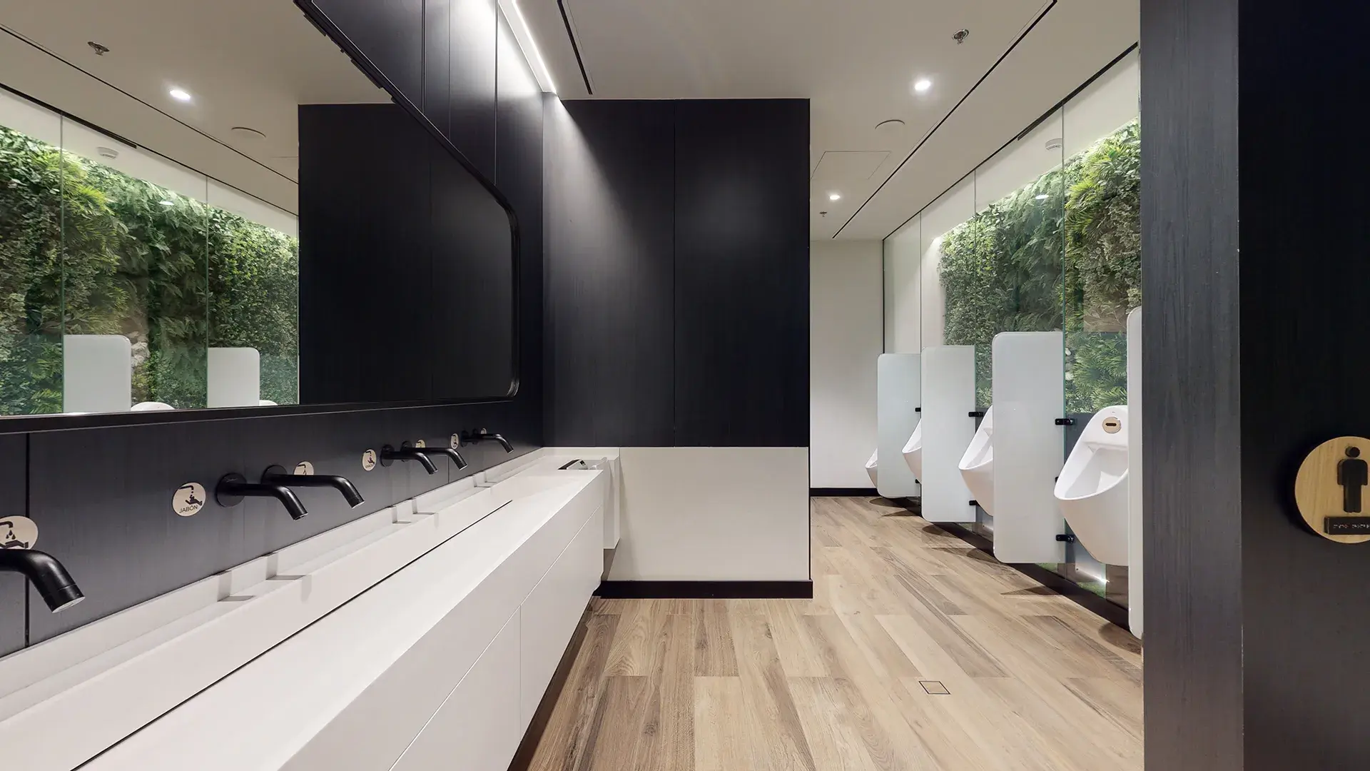
Inside the building, the common areas have been completely reshaped: the mall, the toilets and their access corridors, the SAS in the basement floors and the lifts and escalators, using a chromatic range of woods, whites, blacks and plant elements, homogenising the atmosphere of the centre.
Shopping centres in general, and Max Center in particular, are organised around the shopping mall or mall on which the shops are located. This gallery connects larger spaces, called plazas, in an attempt to emulate the behaviour of any urban infrastructure. It is in these plazas where the greatest design efforts are made. Suspended decorative elements, lighting, furniture, signage, digital screens, in short, different resources aimed at signifying these spaces within the shopping centre and thus distinguishing them from the mall, are usually installed in them. These spaces are also often used for the different events that are organised in the centre and which energise the life of the entire mall. It is usual to theme each of the plazas in order to give them a name that identifies them and helps in the orientation in the centre.
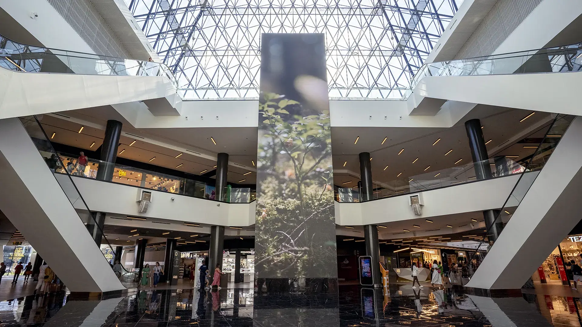
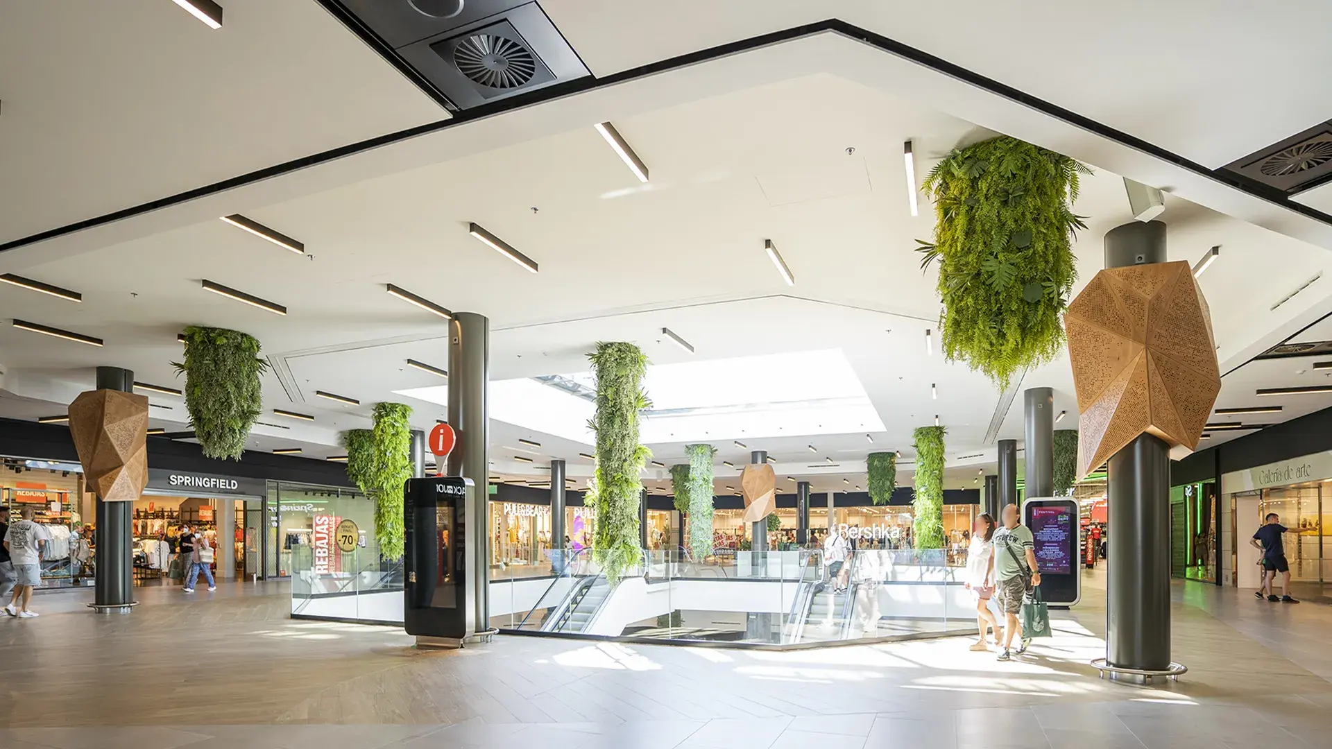
In Max Center, after the refurbishment, the squares have been renamed Plaza Mountain, Plaza Pirámide and Plaza Digital, in each of them, elements have been installed to signify and differentiate them. In Plaza Mountain, wood has been used for the paving and for the cladding in the form of trees covering the pillars, and vegetal elements have also been suspended from the ceiling. In Plaza Pirámide, the main lift has been covered with a digital screen that is constantly offering content with which users can interact with. A particularly attractive element that adds an immersive public address system to provide a pleasant user experience. In the shopping gallery itself, new furniture elements have been installed for rest and relaxation, as well as children's play areas, which make the space more attractive for families, turning the shopping experience into a moment of enjoyment.
The work carried out included the raising of the shop front of the premises. This has involved raising all the installations that run along the technical side of the store. The current trend is create a higher shop front in order to obtain a larger display area and greater visibility in the mall. This type of building that the installations which supply the services run along an accessible strip located above the shop front, which makes it possible to carry out maintenance work when the centre is closed without accessing the shops.
To improve accessibility between floors, existing lifting equipment in the central Plaza Digital has been replaced and a new lift and escalators have been installed in the west Plaza Mountain. Thanks to the special care taken in developing all the integral elements of the refurbishment: accesses, lifts, toilets, furniture... the centre has obtained the 4 Star classification of the AIS certificate of accessibility, awarded by the ARS Foundation.
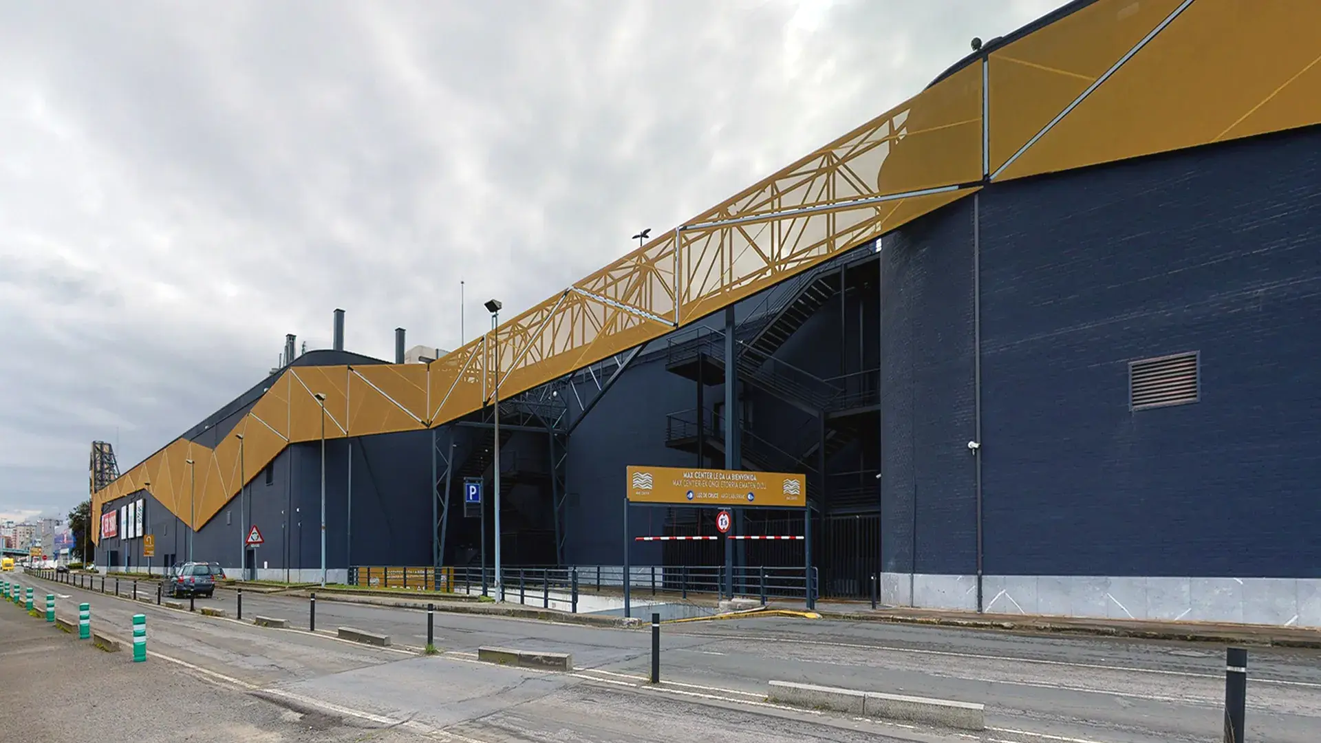
Externally, all the building's façades have been refurbished. The conceptual design creates a double skin for the building that runs along the entire building, adapting its design, composition and materials to the Mountain or City area in which each section is located, following the same design as the interior of the building.
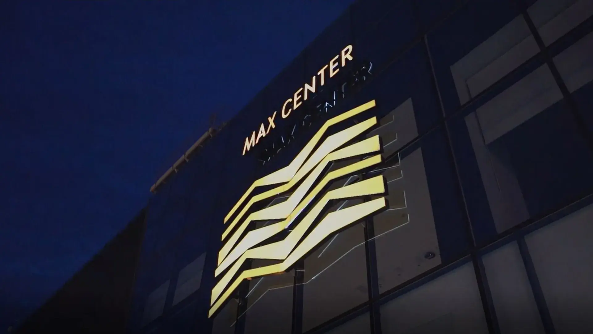
This double skin is fixed to the existing façade, this is the reason why KREAN previously drew up the corresponding project and carried out the works management for the repair of the façade to correct previous pathologies. With this work, a healthy façade was achieved, treated, painted uniformly and prepared to support the new skin. Three different façade treatments were adopted in the refurbishment: in the western part of the building, Mountain, the façade is configured using perforated aluminium sheet panels in different patterns and shades, between which LED lighting elements are integrated, the whole adopting organic shapes from nature; in the eastern part, City, the double skin is executed using golden polyester textile mesh, also integrating linear LED lighting elements; in the northeastern end, a large luminous totem serves as a beacon to position the building when approaching it from Bilbao. In both areas, Mountain and City, new commercial signage elements are arranged and, in the centre of the north façade, at the confluence of the two, the MAX illuminated sign enhances the presence of the centre when driving along the A8 motorway.
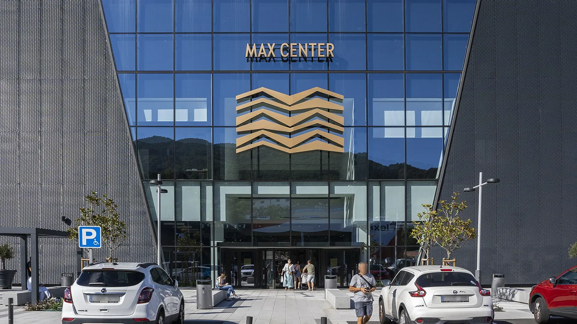
Finally, the section of the façade where the main entrance is located, the south façade, is the one that has undergone the most significant renovation, which also extends to the interior. Part of the existing façade and the interior slab of the management area have been demolished to erect a trapezoidal curtain wall in which a new access module with a revolving door has been integrated. The whole contributes to dignifying the entrance with a double-height space forming a generously lit entrance atrium. The part of the façade not occupied by the curtain wall is unified with a cladding of gold perforated sheet metal.
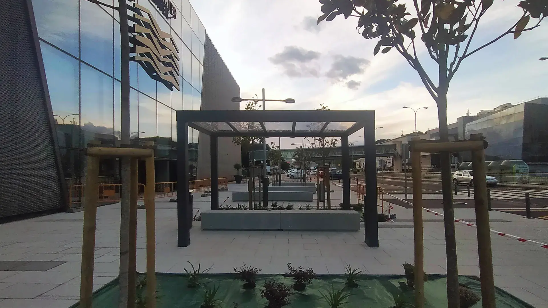
The renovation of the façade has been completed with the renovation of the external urbanisation of the area, creating a welcoming plaza which, in addition to improving pedestrian access to the centre, improves pedestrian safety by separating road traffic from the façade line.
Throughout the process, a large number of operators have either moved into the centre for the first time or expanded their premises. To this end, KREAN has also developed previous projects to adapt the premises to their requirements, framing them in the context of the refurbishment. Among others, we can highlight those carried out for premises of the Inditex Group, Sprinter, Arenal and Ñam.
As with most works in shopping centres, the requirement of developing the work compatible with the normal operation of the centre makes it very difficult to carry out. All the interior works have been carried out at night so as not to affect its operation.
KREAN would like to thank both IBERIAN ASSETS and SONAE SIERRA for the trust they have placed in our team to accompany them in this process.

